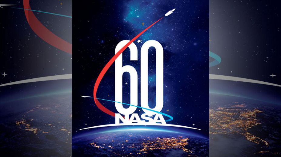
NASA has said the logo it has released for use in observing the 60th anniversary of its establishment as a US government agency in 2018 represents its quest for knowledge.
A crescent moon, a ringed planet and a field of stars amid a nebula of light blue represent the agency’s scientific underpinnings, particularly the enduring quest for answers to age-old questions about the workings and evolution of our planet, solar system and the universe, NASA said on Wednesday.
Advertisement
NASA considers its birthday to be October 1, the day the agency opened for business. The logo depicts how NASA is building on its past to soar toward a challenging future.
“NASA” and “60” are stacked, bold and tall, atop the continental US, the curvature of Earth, and the light of an approaching dawn.
This placement, according to NASA, captures the spirit of a metaphor about knowledge and discovery, often attributed to 17th century physicist Isaac Newton: “If I have seen further than others, it is by standing on the shoulders of giants.”
Similarly, the agency too was built from the legacy and expertise of giants in government-sponsored research and development, it said.
The light blue and white arc just below the alphanumeric elements recalls the sunrise, seen 16 times each day aboard an Earth-orbiting spacecraft, and symbolizes opportunity yet to come through exploration of the Moon, Mars and destinations far beyond, NASA said.


