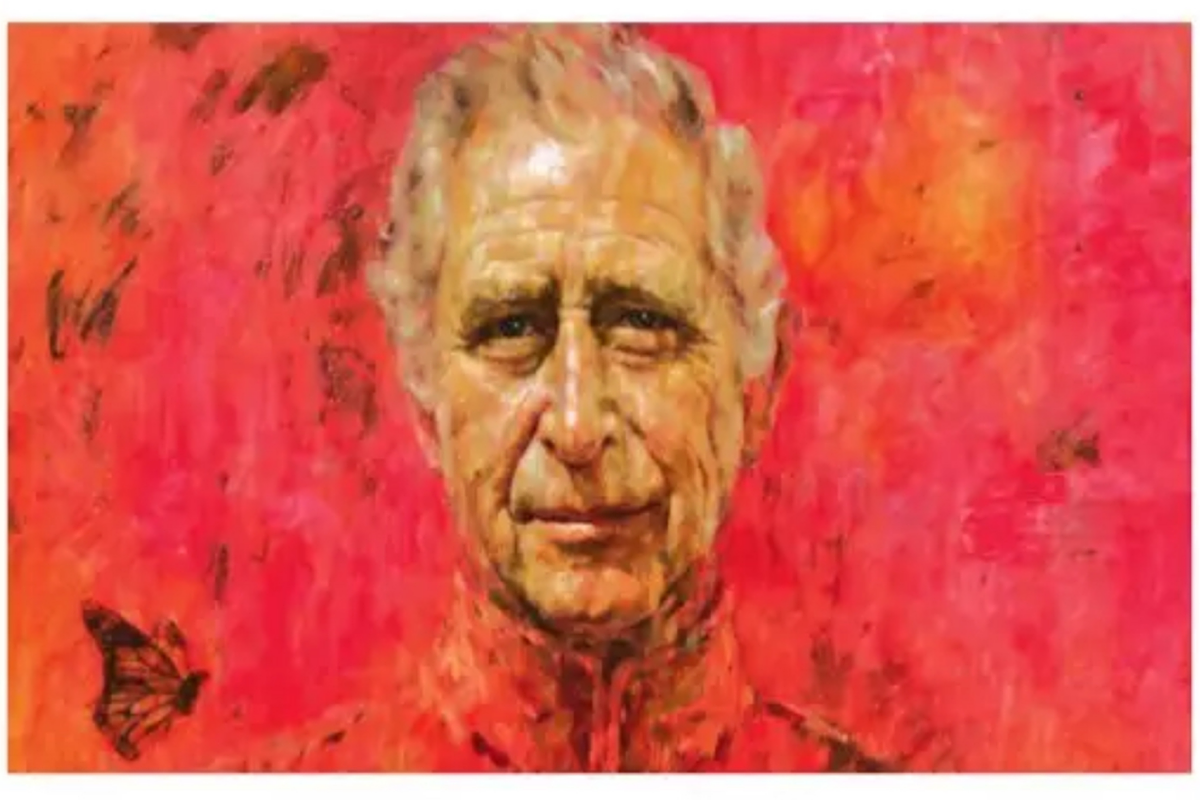
My good friend, Sharon, who is an amateur artist like me, brought to my attention the recent controversy related to a portrait of King Charles, unveiled a few weeks ago at Buckingham palace. It is a rather large painting, 8.5 ft by 6.5 ft in dimensions and the first portrait of the king since his coronation last year. A photo of the portrait is shown here. It immediately generated a huge backlash because of the overwhelming presence of red colour in the image. The colour of his uniform represents the colour of the Welsh Guards (which included Charles as a member when the painting was first commissioned in 2020), but the red background was a choice of the artist.
Viewers started to describe on social media as a devilish image. Here are some typical comments: “looks like a poster for a truly nightmarish horror movie”; “looks like the villain Vigo the Carpathian from Ghostbuster 2”; “looks like he is going straight to hell”, “antichrist in blood”, “satanic”. Some even claimed that they can see demonic images by photo-shopping the image in various ways. It drew ridicule from people like Russell Brand and Alex Jones. It seems that even the ones who praised it did so out of respect and courtesy for the king in a typically British polite way. According to reports, Charles was surprised by the bold red colour but “smiled approvingly”. Queen Camilla was more definitive, telling the painter, “Yes, you got him”.
Advertisement
I wondered why the king liked it. Is it because Charles is colour blind like his son, Prince William, and perhaps the painting looked greenish to him? The Internet offered no such clue. The painter is Jonathan Yeo, who is claimed to be one of the “most in-demand portraitists” by GQ magazine and has painted images of Tony Blair, Tiger Woods, Sarah Palin, Arnold Schwarzenegger and other famous people in the past. In the painter’s own words, “I do my best to capture the life experiences etched into any individual sitter’s face. In this case my aim was also to make references to the traditions of royal portraiture but in a way that reflects the 21st century monarchy and above all enable to communicate the subject’s humanity”.
The reference to “21st century monarchy” can certainly refer to all the bloodshed going on in the world starting from 9/11 at the beginning of the century and the red colour symbolizes blood. Perhaps it is also a subtle reference to the root cause of all this violence which goes back to the days of colonization by the British and other European countries. The phrase “subjects’ humanity” could mean the passion and romance Charles exhibited throughout his life in his relentless pursuit of Camilla even when she was married to another man. What colour is more appropriate than red to indicate love and passion? There is one other interesting aspect of the painting: there is a monarch butterfly pictured on the right shoulder of the king. It is supposedly a symbol of the king’s love of nature, freedom and metamorphosis (from prince to king). However, it appears to be small and without its own usual colourfulness.
I am baffled by the colour scheme myself. Even if I could justify the overall red tint as a symbol of passion, I felt that the painter could provide a higher level of contrast between Charles’ outfit and the background. The way it looks gives the appearance of a head floating in a sea of red. It also reminded me of that infamous prom scene from the movie “Carrie” where Carrie was drenched in pig’s blood. Just like many famous artists, Yeo probably wanted to create something very unusual. At the same time, he deliberately wanted to create some controversy which could bring him notoriety and with it, popularity and fame. I was shocked to read the story of one of Yeo’s techniques of creating ùportraits which he used in several of his past works and in a portrait of George W. Bush in particular. From a distance, they look like normal portraits but on closer inspection, one can see that they are made of collages of cut-outs of pornographic images. The Bush painting was supposedly a satirization of the assumed moral superiority of the extreme right in American politics. Although I am a supporter of nudity in painting, pornography has no place in serious art in my view.
Yeo seems to be eccentric and/or disturbed. It is surprising that there is apparently no official group assigned with the task of selecting the artists to paint royal portraits. Yeo was chosen by Draper’s Company, a philanthropic institution, and originally commissioned in 2020 to celebrate Charles’ 50 years of membership in the organization. I don’t know why they chose Yeo with the full knowledge of his controversial past. The fact that he used pornographic pieces to do paintings of American celebrities suggests that he is perhaps anti-capitalist, if not antiAmerican. Is it possible that he holds communist views and the red colour in Charles’ portrait reflects the colour of “red” China? There has also been speculation that perhaps there is a hidden message underneath the dabs of red paint which can be revealed by sophisticated techniques. I asked myself, if I were to change the colour scheme of Yeo’s painting without starting over what I would do. I must say that I like Charles’ face in the painting where, as Camilla said, the painter got him. However, I will replace red everywhere with some other colour; but what colour? My first thought was green because King Charles has reportedly been an environmentalist from an early age. My second choice would be blue/navy. Since Charles served in the Royal Navy, I would paint his uniform in navy and blend it with a lighter blue in the background. Sharon generated images in other colours using software in her computer. Any of those versions would have been less controversial and still represent a bold image of Charles. Being a fan of Gustav Klimt’s paintings, I like the colour gold ala his “the lady in gold”. Gold, after all, is a symbol of wealth, prosperity and success and would have been perfect for representing a king’s image.
I was very dismayed by this painting at first because I have seen hundreds of magnificent paintings of royals in various museums and art galleries throughout the world, done in vivid realistic colours. I did not see the point of displaying such a grotesque painting. However, I have since learned that Charles already has 170 of his portraits in different poses at various exhibit halls in London and his mother, Queen Elizabeth II had more than 960 paintings done during her reign. I now believe that one abnormal painting out of hundreds does not have any significant impact on anything and it was all much ado about nothing. A fitting postscript to this strange story is the protest by the animal activist group, “Animal Rising”. Members of the group pasted cartoon images and messages on the portrait in a London art gallery to protest treatment of animals in the UK under supervision of RSPCA (RSPCA is patronized by King Charles). The portrait was not damaged. Perhaps the best place to store the portrait is a backroom in the palace. (The writer, a physicist who worked in industry and academia, is a Bengali settled in America.)