5 big furniture ideas for small spaces
In this day and age, with the correct measures, a small space is no longer synonymous to ‘lack of creativity’.…
The key to a beautifully designed space spruced with colours is balance–of colour — neutral and accent, of prints and patterns. When all three are used in the correct proportions, the magic unfolds. If not, the space will be loud, overwhelming and tacky.

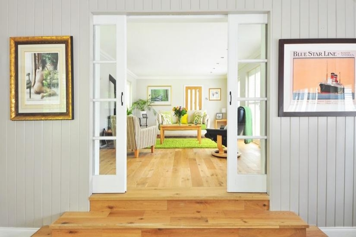
(Representational Image; Source: iStock)
Colours add life to living spaces, by reflecting people’s personalities and also shaping their behaviour through colour therapy. When used right, hues and tints elevate the spatial quality, making it eye-catchy and unique.
With technological advancements, colours can easily be incorporated through various forms, one of which is prints. However, pairing colours and prints correctly and using them in appropriate proportions is the key to making or breaking a space.
Advertisement
Devika Khosla, Creative Director, The Works Interiors, shares a few tips and tricks to spruce up your space, while dabbling in prints, colours and patterns —
Advertisement
* Go to your colour wheel, take inventory of all the warm and cool colours available; look for complementary colours, monochromatic tones, secondary colours. Pair them as per your preferences.
* Know your options — Colours can be used in various ways — in solid tones, prints, and patterns. There is a range of options available for prints and patterns in every building material you can think of; be it tiles, wallpapers, fabrics, laminates or even textured paint.
* Pick one primary dominant colour, which could ideally be a neutral tone and pop it up with secondary and accent colours. This will help you tone down the space and provide a good ground for the play of colours.
* Remember to use colours through a balanced mix of solids, prints, patterns and textures in different elements of the space — furniture, decor and other features. Think of colours and prints in soft furnishings, curtains, cushions, throws, rugs, trinkets, books, art pieces, photo frames, lamps etc. These accessories play a fundamental role in tying the whole space together.
* To create a mood board before implementing it on the space, collect your preferred colours–layer solid tones through patterns, prints, and textures. Use different materials to accentuate the layering.
* When layering patterns, it is best to combine prints in different styles and scales.
* The key to a beautifully designed space spruced with colours is balance–of colour — neutral and accent, of prints and patterns. When all three are used in the correct proportions, the magic unfolds. If not, the space will be loud, overwhelming and tacky.
Keep the feel of the space in mind. Regardless of the overall design sensibility, it is possible to incorporate colours and patterns in different kinds of design styles and ideologies. If the style is minimalist, one can use abstract prints and sophisticated shades. For a neutral space, the pop can be brought by placing a bright coloured chair or an eye-catching piece of furniture. Or, one could use a bold coloured sofa by a neutral wall and tone down the effect with some neutral accessories. Remember that eclectic doesn’t mean randomly putting colours together; instead, it needs to be more thought through. But do not fear to go bold with colours and prints, for that would make our lives and spaces mundane and monotonous.
Advertisement