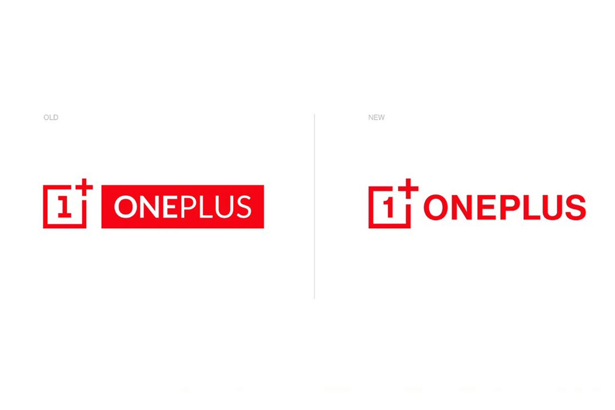
After successfully running its business for the past six years, OnePlus felt the need to update its identity, especially when it is competing with some of the well-established brands across the globe. That’s why the company reworked on its logo and launched it on Wednesday.
You can see the new logo at company’s website in India, China, the US as well as on its all social media pages.
The new logo is not different from the old one but if you look closely for the details, you will realise there are certain details that have been changed.
Advertisement
The logo introduces a new curvilinear “1” that is easier to read while adjusting the weight of the logotype for better overall balance. The “+” in the surrounding box has also been enlarged and is now more prominent.
“OnePlus is not changing who we are, but reinforcing what we stand for – the true spirit of ‘Never Settle’,” said Mats Hakansson, Global Creative Director of OnePlus.
“We always design for our users. We feel that these changes maintain the iconic elements of our brand that are beloved by our staff and our community while injecting both excitement and balance into our visual identity,” Hakansson added.
The company believes that the refreshed logo creates a clearer association between the symbol and the trademark, while also allowing for more flexible application and improved recognisability in digital media.
The visual identity is accompanied by a fresh colour palette which centres on OnePlus’s iconic red, followed by an updated secondary palette of cyan, green, magenta, indigo, and yellow to make the company’s design and assets more vibrant and lively.
A new font also improves legibility and is easier on the eyes, the company said in a statement.
“No detail is too small. By starting from thousands of user data points, the team arrived at a new holistic visual language inspired by OnePlus’ burdenless philosophy,” Hakansson said.
(With input from agencies)
Advertisement


